MyLight
-
Year
2021
-
Client
Lemonade
-
Type
Visual identity, Editorial, Packing
-
Local
Seul
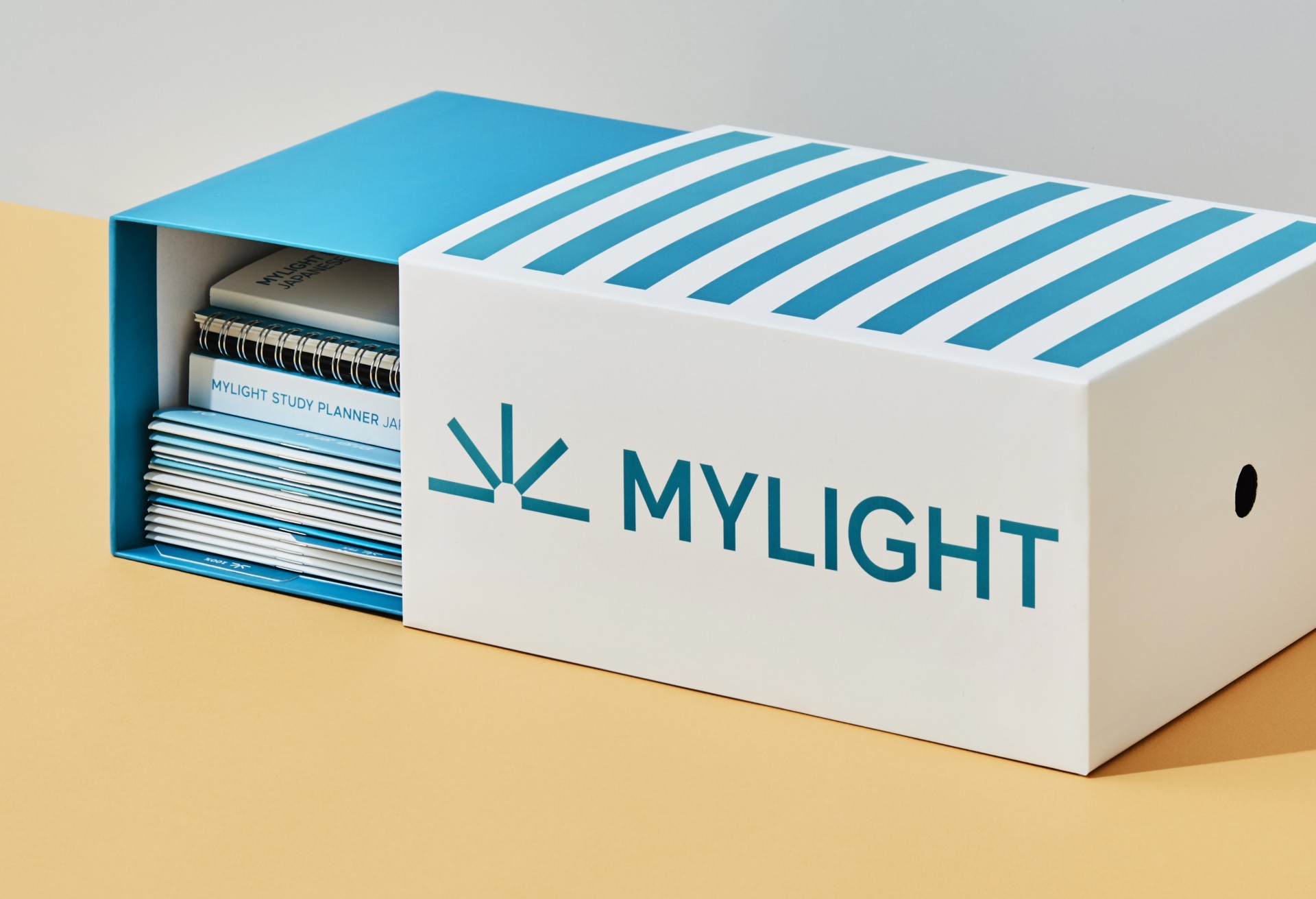
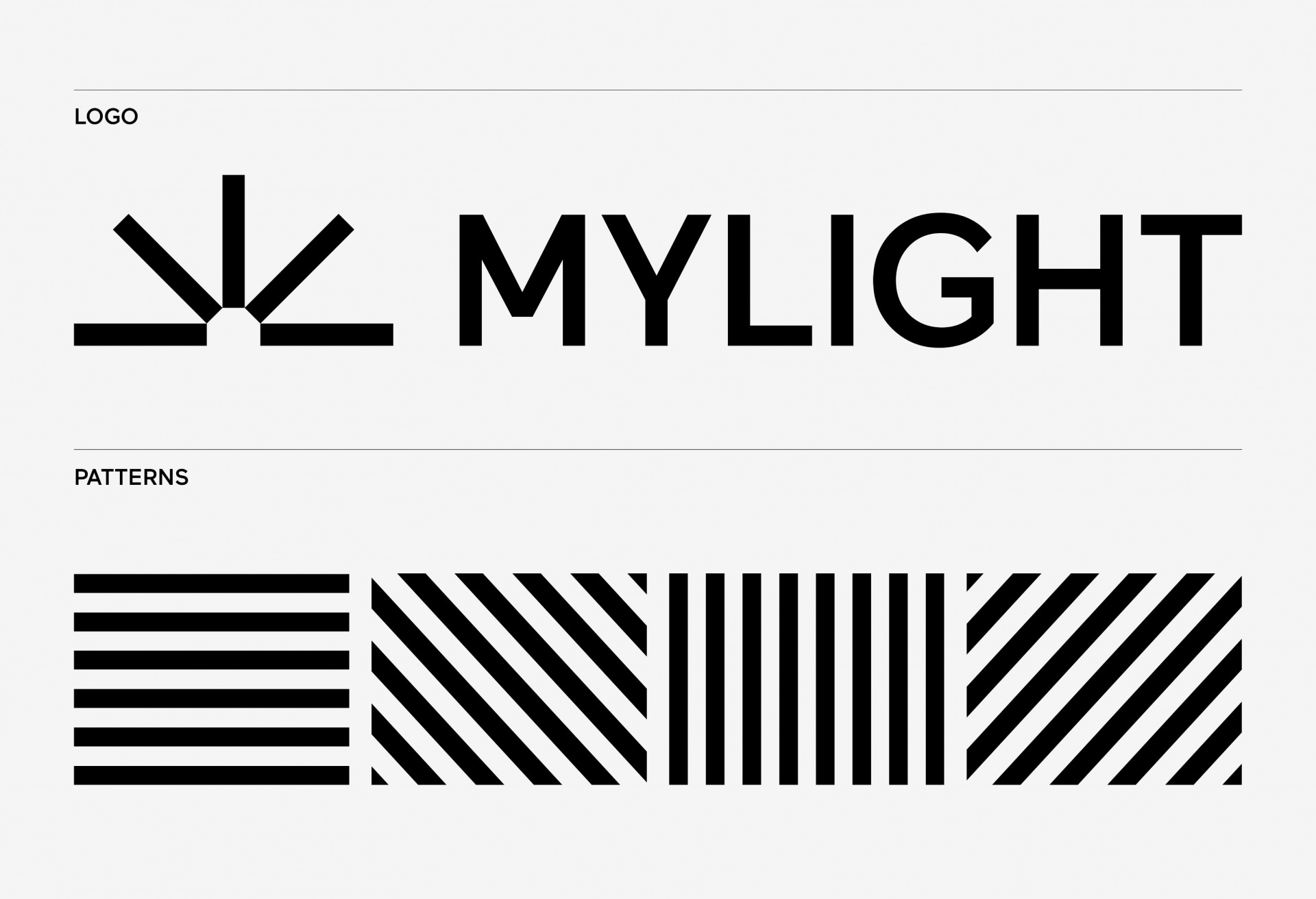
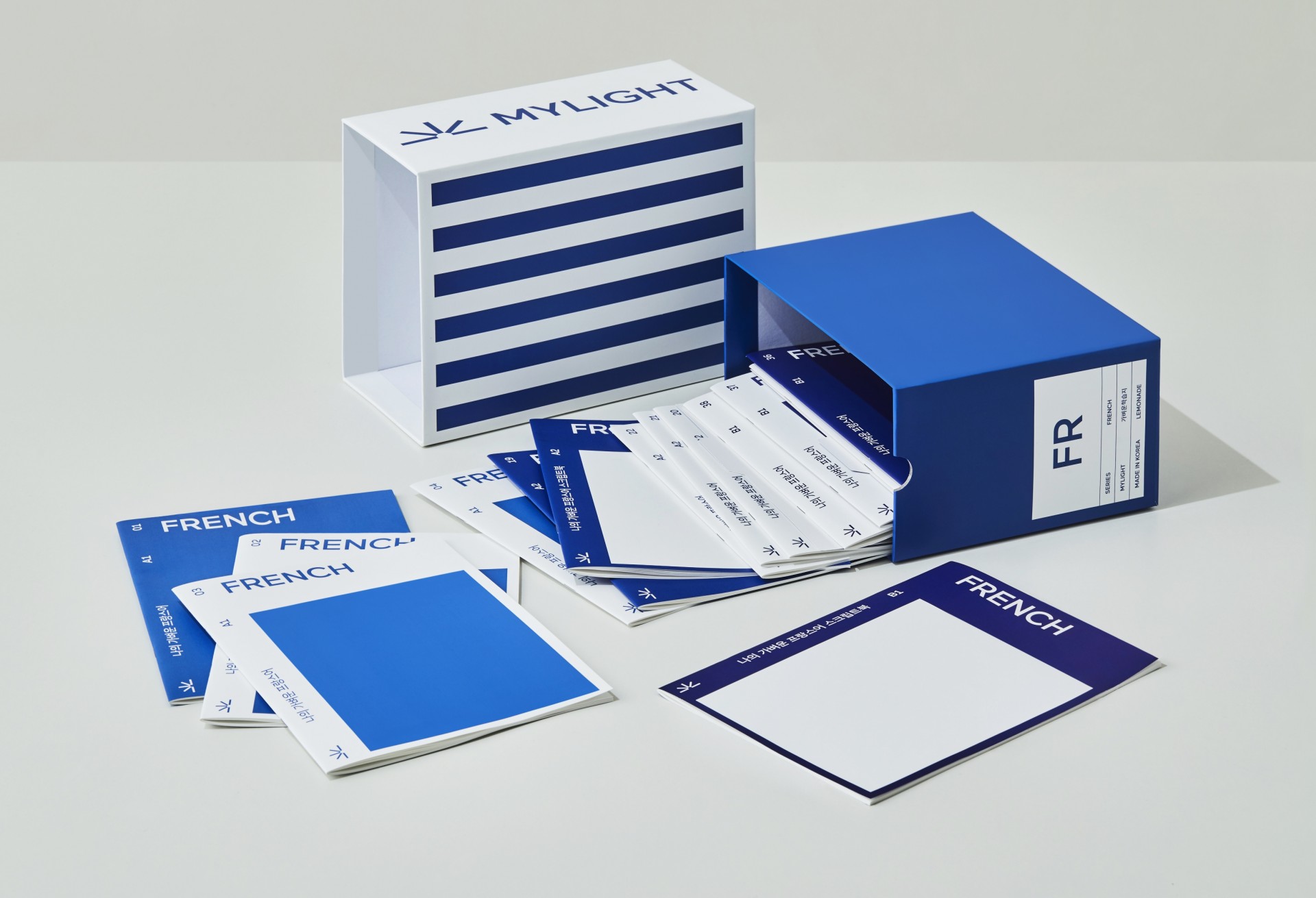
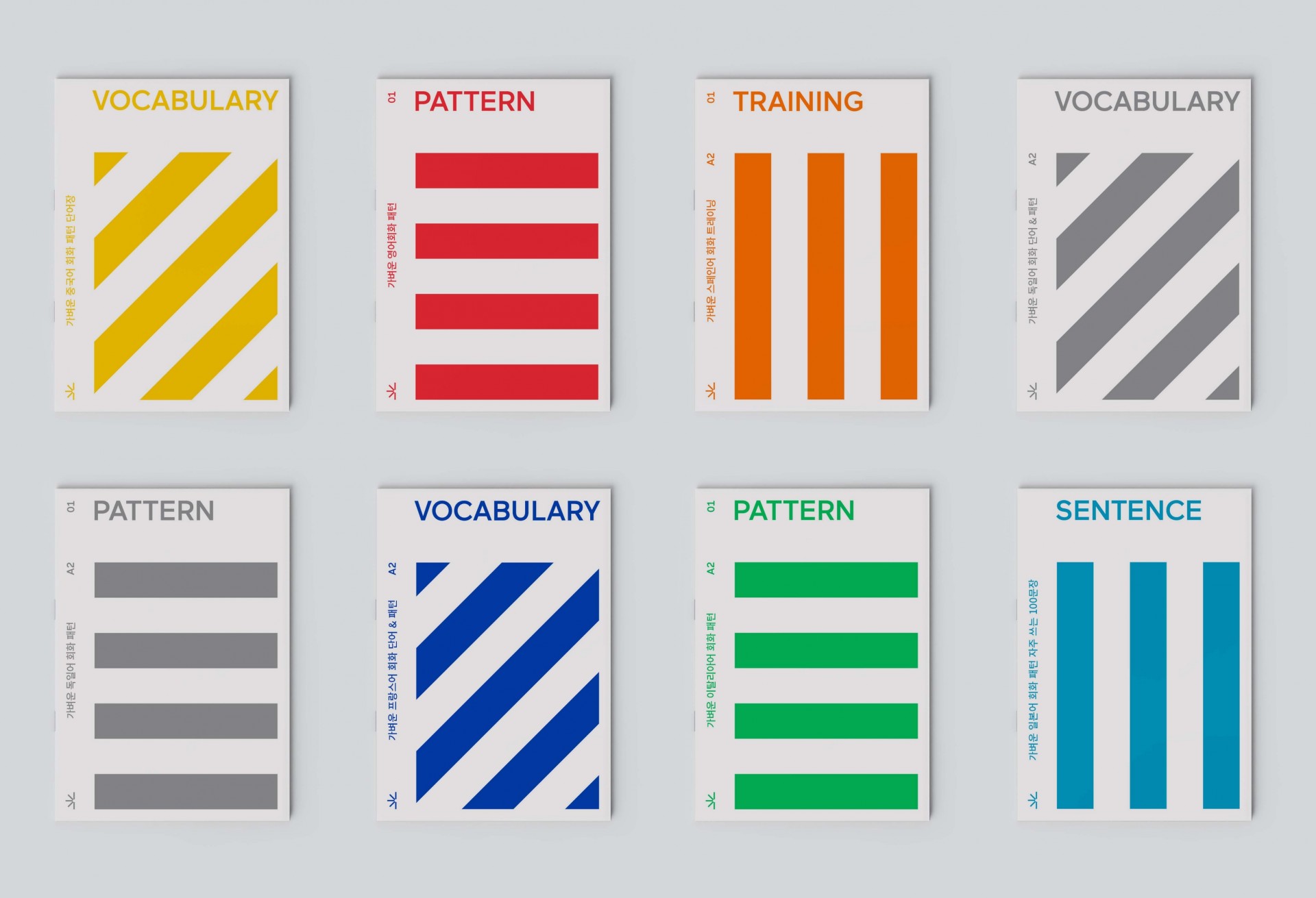
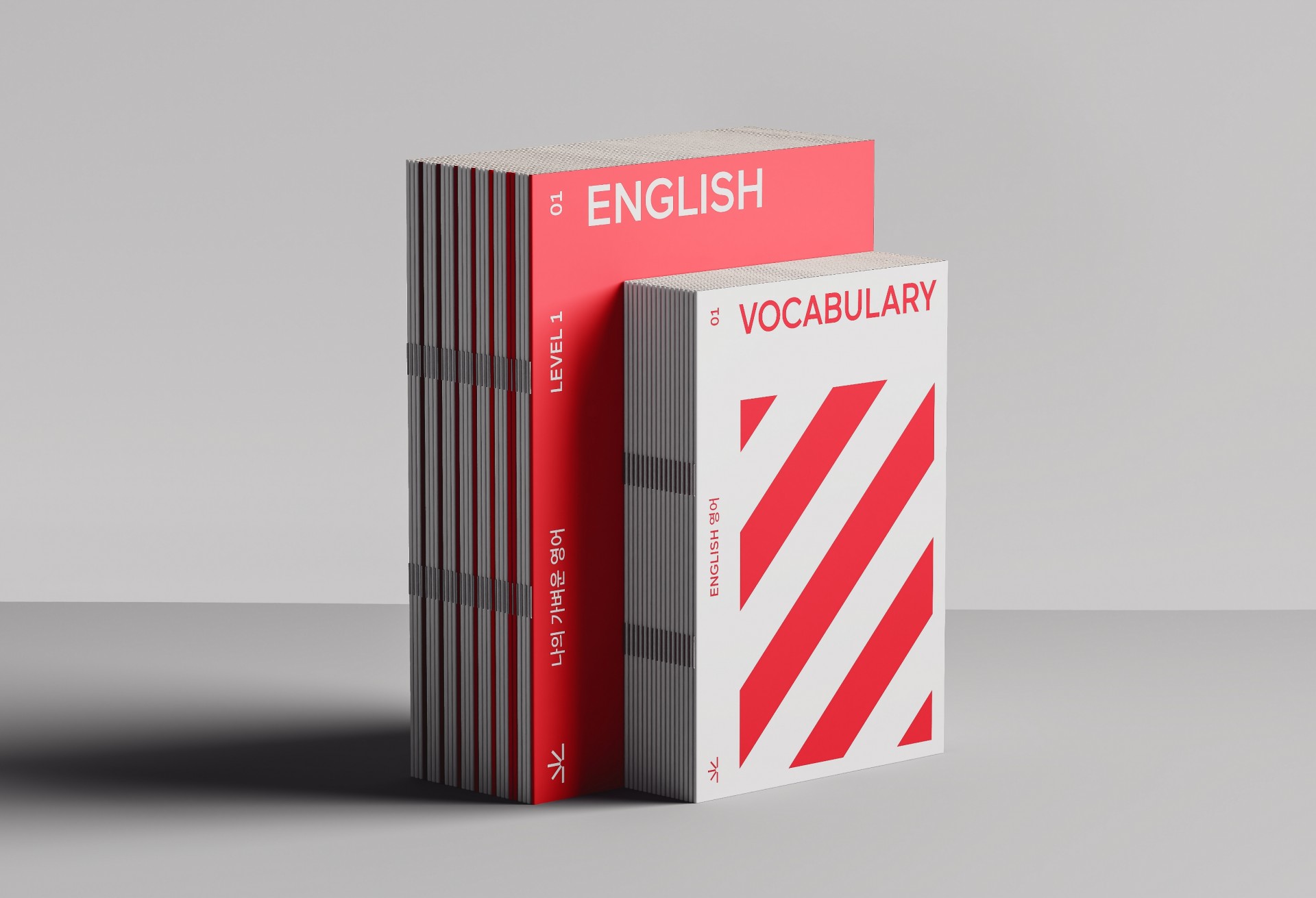
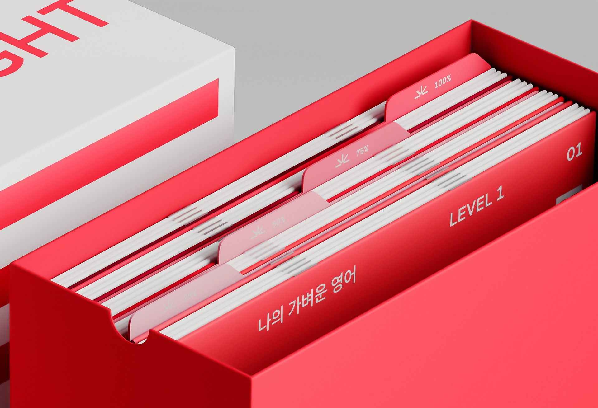
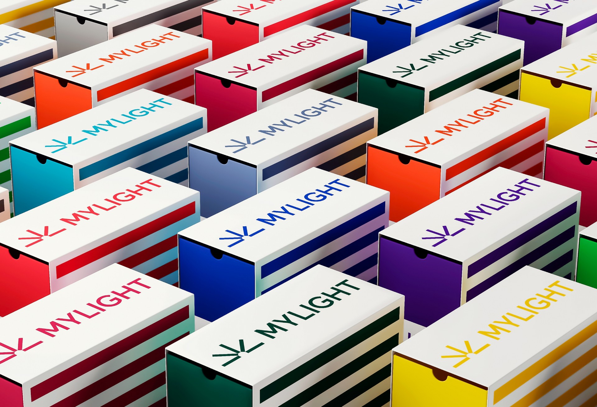
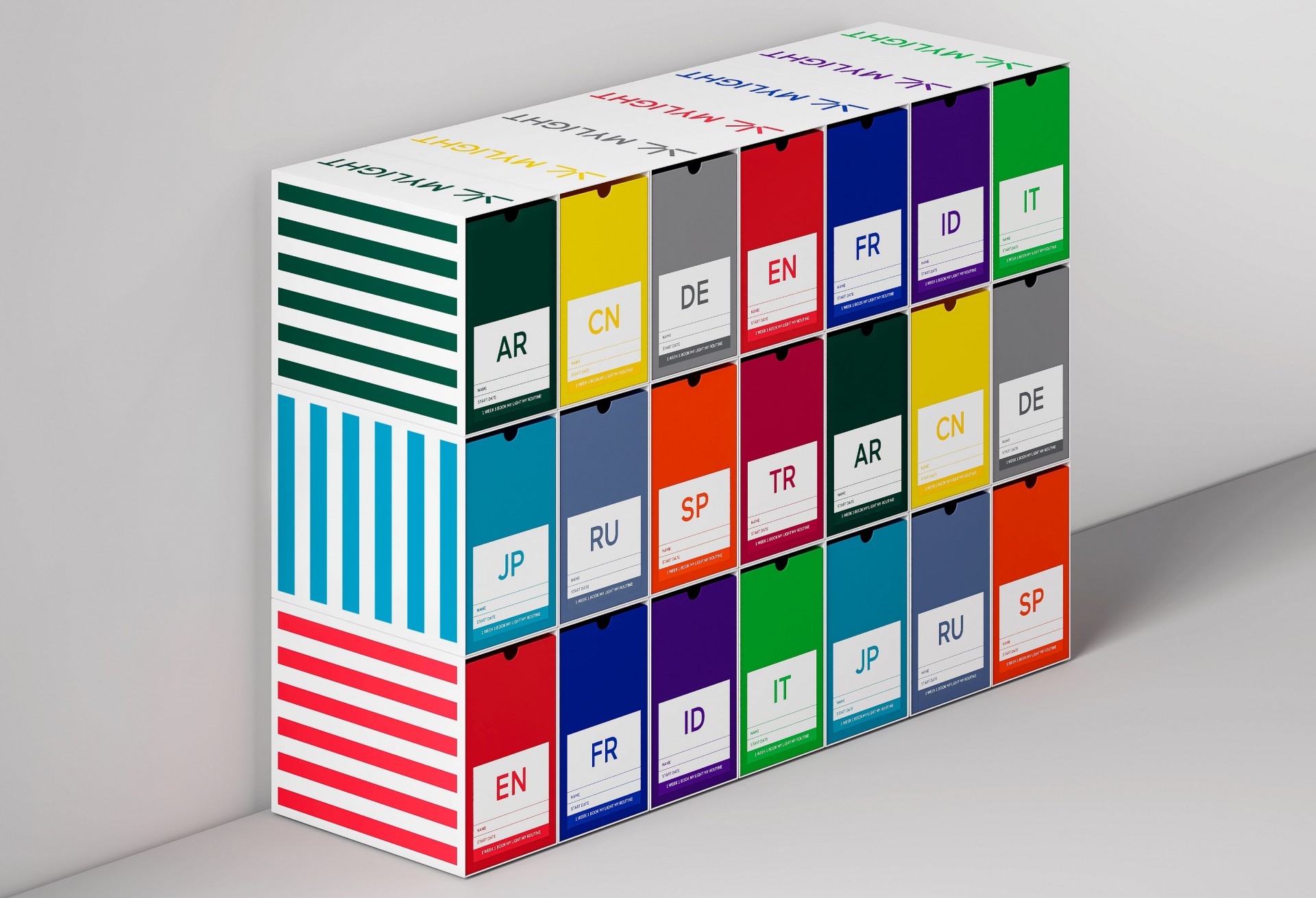
MYLIGHT is a South Korean company that operates in the area of language teaching. In collaboration with the company’s design team, we developed the new visual identity, book covers and packaging. Inspired by the theme of education, the logo resulted in a symbol that refers to the design of an open book. For the covers, we use patterns composed of lines in different angles and combinations, built from the design of the symbol itself. The packaging design was prepared to accommodate the books, thinking about their functional aspect and resistance.