Nommo
-
Year
2021 – 2022
-
Client
Nommo Arquitetos
-
Type
Visual identity
-
Local
Curitiba
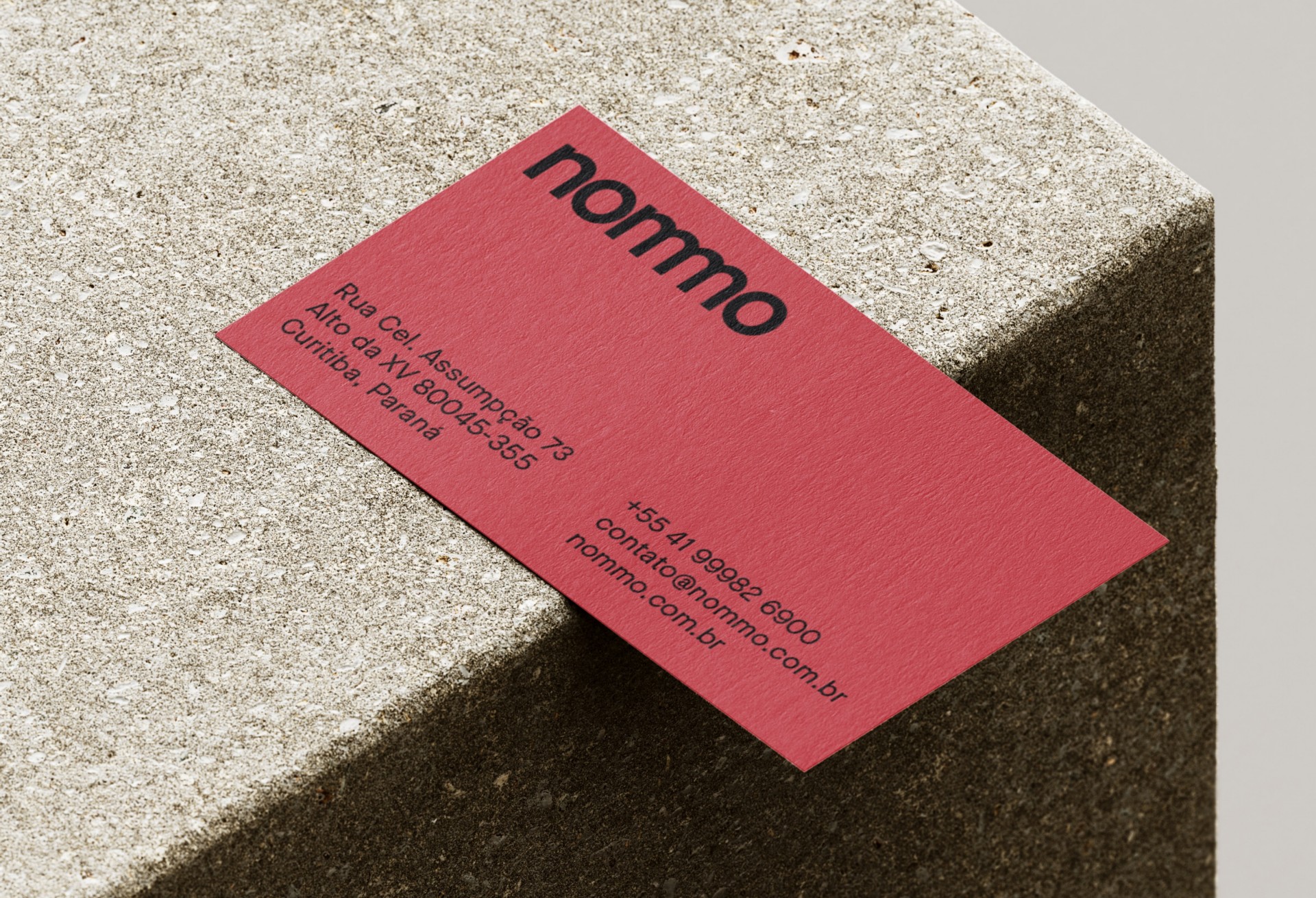
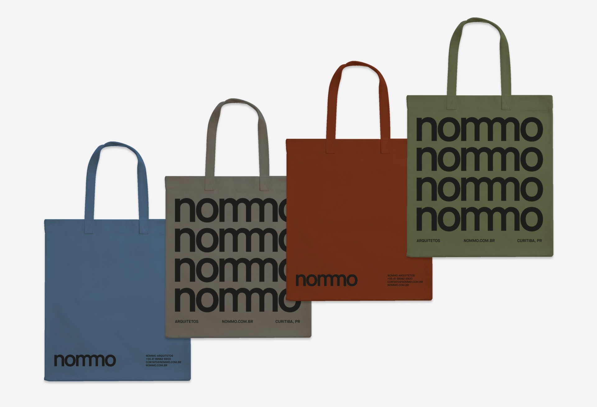
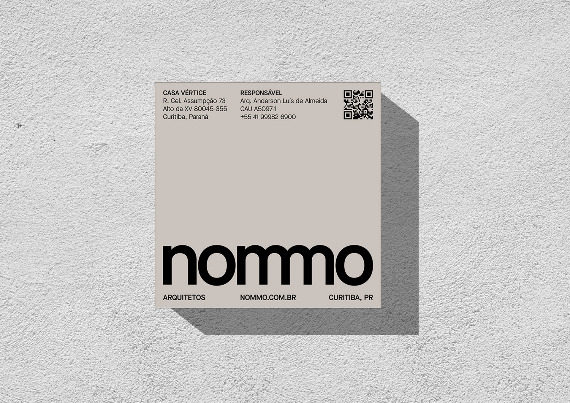
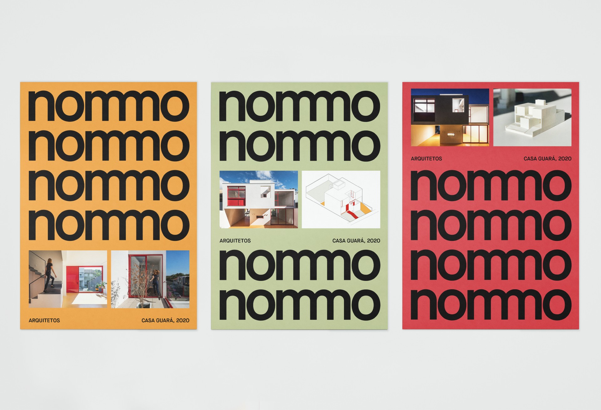
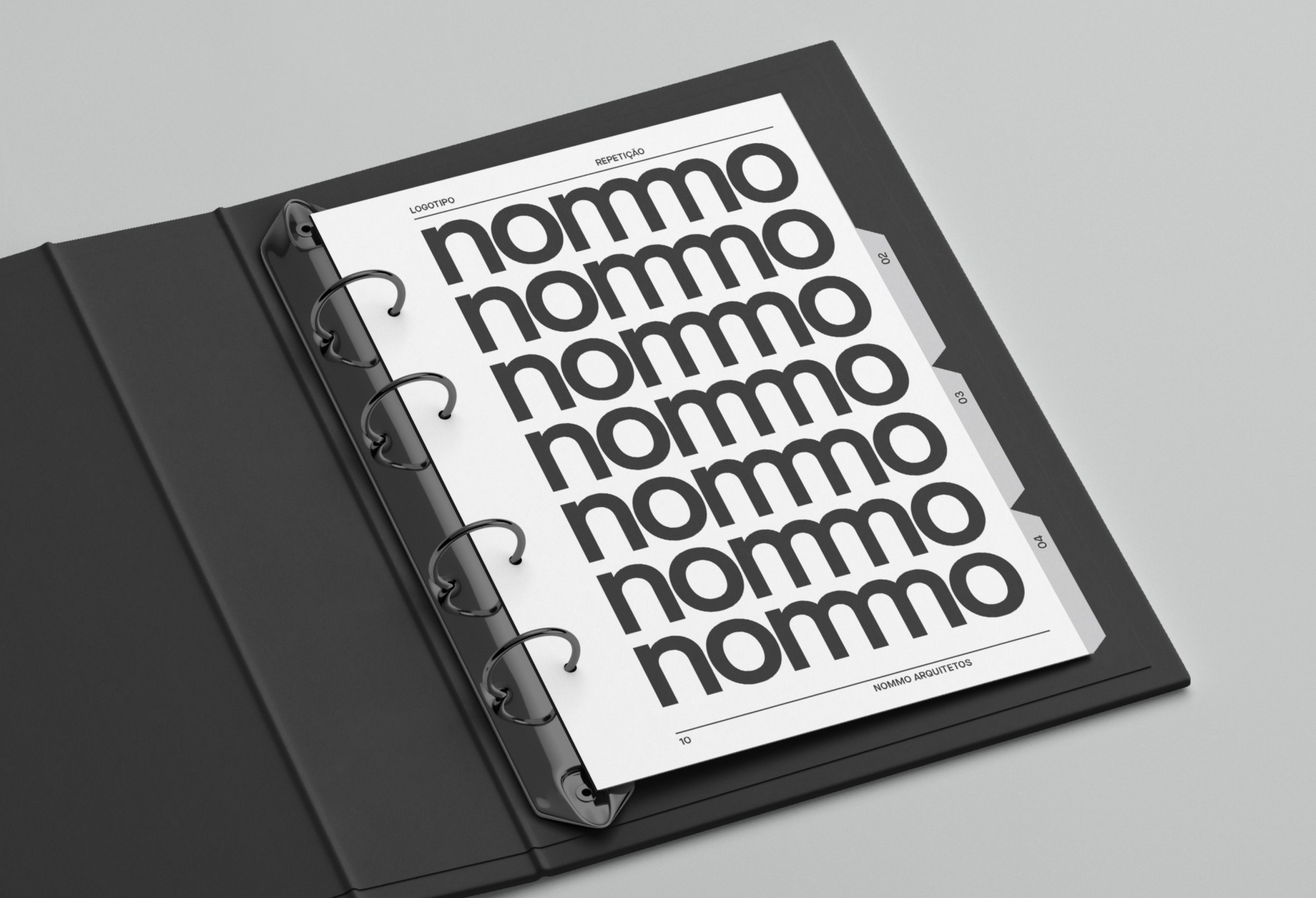
The new visual identity of the nommo architects reflects a new moment in its history, which after seven years of existence is established in the national architecture scene with a more mature and contemporary positioning. The brand is the central element of the new identity, planned to symbolically reflect the activities, achievements and objectives of the office. Its design starts from the joining principle: the letters are closer, as well as the relationship of the office with customers. In this logic, the symmetry of the design of the double m (mm) allowed the overlapping of the letters, resulting in a single character that brings personality to the drawing. The new identity unfolds in a system that uses the repetition of the logo itself as a graphic element, reinforcing the concept of occupation of the city.